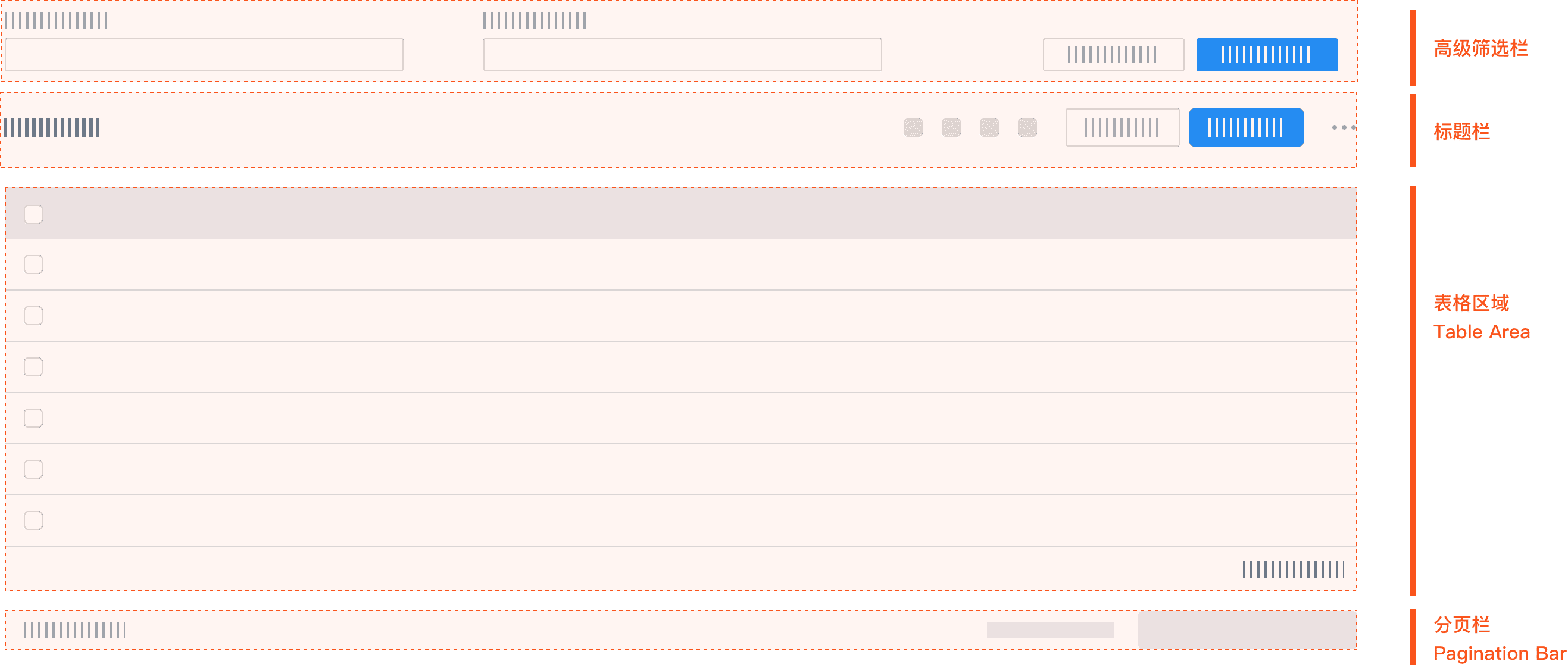
ProTable 高级表格
ProTable 是核心组件之一,该组件致力于解决大数据渲染等复杂高频问题。使用该组件可以流畅滚动 10 万行、10 万列的数据,你不必担心页面卡顿造成用户投诉,进而影响业务进展。
使用演示
基本使用
简单表格,使用分页切换数据。使用边框线、斑马纹等清晰呈现各数据单元格边界线,辅助信息区隔。
固定表头和列
对于列数很多的数据,可以固定前后的列,横向滚动查看其它数据。对于数据量非常大且没有分页的数据,可以固定表头,竖向滚动查看其它数据。如果数据行和列都非常多,建议开启virtual虚拟滚动。
可通过给列属性设置 fixed: 'left' 或 fixed: 'right' 以达成固定列效果。
你需要设置表格属性 scroll="{ x: 1500 }" 或者给每一列都设置宽度,当 scroll.x 或 列宽总和超过表格宽度时出现横向滚动条。
你需要设置表格属性 scroll="{ y: 300 }" 或通过 height 或 maxHeight 设置表格高度,单位同 CSS 属性。建议使用 maxHeight 自适应高度。
height 是固定表格高度,不受内容多少的影响,height 和 scroll.y 一般只需要设置一个,当然你可以同时设置,组合出你想要的效果。
表头吸顶/分页吸底
- 表头吸顶,设置
sticky=true即可。如果需要调整吸顶位置及更多配置,使用sticky: { offsetHeader: 80 }。 - 分页器/滚动条吸底,设置
paginationSticky=true即可。如果需要调整吸底位置及更多配置,使用paginationSticky: { offsetBottom: 60 }。
注意
吸顶和吸底是使用的 position: sticky 实现,如果发现吸顶没有生效,请排查 table 父元素是否有元素设置了 overflow,具体原因请查看规范。
合并表头/单元格
根据数据结构,可以将表格中的行列进行合并。
- 使用列属性
colSpan设置表头合并。如果是多级表头,请参考下方「表头分组」示例。 - 使用列属性
customRender设置表格内容合并元格,单元格属性colSpan|rowSpan, 当设值为 0 时,设置的表格不会渲染。
表头分组
表头数据标签可采用分组呈现,表述信息层级包含关系。
- 表头分组的配置只需要在列配置中添加
children子列配置即可。 - 表头分组中的固定列,必须指定第一层
fixed属性,不支持子列固定。 - 表头分组中的列宽设置,只需指定最后一层表头宽度。
滚动到指定位置
通过 scrollTo 方法滚动到指定位置,默认不开启动画。
对于动态行高,虚拟滚动会动态修正行的位置,如果需要滚动到指定行,很有可能并没有滚动到预期位置。
Tooltip 自定义提示
使用 tooltip.title 自定义更加友好的提示。
使用 headerTooltip 配置表头提示。headerTooltip = true使用title配置提示。
你可以全量开启 tooltip,不用担心性能问题。本示例,姓名、邮箱 两列开启了 tooltip。
单元格超出省略
支持单元格文本超出省略,支持文本多行超出省略。表头标题超出自动省略,如果表头标题不想省略,参考自动高度。
使用 ellipsis 设置列文本超出省略显示;只要 ellipsis 为真,无论是何种数据类型都会出现超出省略。
使用 ellipsis: { line: 2 } 设置列文本多行超出省略显示。
自动高度
配置表格属性 auto-header-height 开启表头自动高度。拖动第一列查看效果吧。
列设置autoHeight: true 开启列自动行高。拖动邮箱列查看效果吧。
注意
当自动表头高度时,表头部分会降级到全量渲染,如果你有很多很多很多列,全量渲染对表格性能有一定的影响。
不建议对每一列都设置自动行高,虽然你可以这么做, 对于大多数场景,一般只有少数几列会有自动行高的需求。
表尾总结栏
通过 summary 插槽设置总结栏。因为支持设置多行总结栏,所以不能简单的通过属性进行设置。
使用 pro-table-summary-row 设置一行,pro-table-summary-cell 设置列。
你可以通过在 pro-table-summary-cell 上设置 index 和 colSpan,来表示展示位置和合并列数。
注意 index 指的是所在列的位置,当有展开列或选择列时,会影响 index 的数据。
你可以通过插槽 default 获取组件内部自动计算的和,当然你也可以设置任意内容。
自定义样式
自定义 Header、Body、Summary、Row、Cell 的样式。 由于有固定列、固定行等功能,没有办法简单的改变样式。
自定义表头/单元格
表头标题默认使用 title 渲染,自定义标题则有以下 2 种方式:
- 使用
title作为渲染函数,函数参数为:({ column, sortColumns, filters }) => VNode。 - 使用
headerCell插槽,插槽参数为:#headerCell="{ title, column }",根据column.key判断自定义渲染那一列。
单元格默认使用 row[dataIndex] 渲染数据内容,自定义单元格有以下 3 种方式:
- 【推荐】使用
customRender作为渲染函数,函数参数为:({ value, text, record, index, column }) => { props: {key, class, style, colSpan, rowSpan }, children: VNode } | VNode。 - 使用
bodyCell插槽,插槽参数为:#bodyCell="{ record, column, text, value, index, oldValue, recordIndexs }",根据column.key判断自定义渲染那一列。 - 使用
renderText渲染函数,函数参数为:({text, record, rowIndex}) => string | number,只支持返回字符串,适合拼接|计算等操作。
虚拟滚动
虚拟滚动提升渲染速度,树形数据、展开内容、嵌套子表格、行列合并、自动行高、横向、纵向、吸顶、固定头、固定列等等一切都支持虚拟滚动。
- 虚拟滚动一般用于超大数据渲染的场景,以提供更优的前端性能表现,设置
virtual=true即可开启虚拟滚动模式,设置xVirtual=false可以关闭横向虚拟滚动。 - 虚拟滚动根据表格高度计算渲染数据,所以必须设置
scroll.y和height其中之一。
分页配置
组件默认开启了分页,你不但可以通过表格属性 pagination 配置显示或隐藏,还可以配置显示位置。你还可以配置 Antv Pagination 组件的其它部分属性。
当 dataSource.length 长度超过 pageSize,单页已无法完整地显示数据,此时会自动开启本地数据分页,组件内部会对 dataSource 进行分页。如果希望禁用组件内部分页,可以设置 pagination=false关闭分页。
提示
如果关闭了分页,且表格没有设置height | scroll.y和开启 virtual虚拟滚动,表格数据将全量渲染,数据量大将会造成性能问题。
拖拽排序
支持拖拽表格行调整顺序,支持拖拽表头调整列顺序。支持拖拽表头调整列宽。
- 设置列属性
resizable = true, 可以将列变成可拖拽改变宽度的列,通过设置minWidth、maxWidth控制列宽的最小宽度和最大宽度,当然这都是可选的配置。 当有些列没有设置 width 时,该列将会是自动伸缩,其它可拖拽的列大小改变时,会重新计算自动伸缩列的宽度。 - 设置列属性
rowDrag = true, 该列将添加拖拽图标。rowDrag 同样可以是一个返回 boolean 类型的函数,用来自定义不同的行是否允许 拖拽。 - 设置表格属性
columnDrag = true,启用全列拖拽(选择、展开除外)。设置列属性drag = true,单独控制某一列是否可以拖拽。 - 组件内部默认使用当前单元格的内容显示提示,你可以使用
rowDragGhost插槽自定义内容。 - 使用
rowDragEnd事件返回promise,可以做行拖拽排序二次确认是否移动到目标位置。 - 使用
columnDragEnd事件返回promise,可以做列拖拽排序二次确认是否移动到目标位置。
提示
拖拽是一个很酷的功能,但你要知道当用户刷新或重新获取数据后,状态会被重置,除非你开启了缓存,使用表格属性 columns-state 设置缓存及初始状态 {persistenceType: 'localStorage',persistenceKey: 'dragable-local'}。
注意:表头分组仅支持叶子节点拖拽修改列宽,表头分组仅支持一级节点拖拽排序。
API
提示
由于功能太多,API还在加速完善中,目前只是部分文档。
Props
| 参数 | 说明 | 类型 | 默认值 |
|---|---|---|---|
| animateRows | 是否开启动画 | boolean | true |
| autoHeaderHeight | 是否自动表头高度,开启后会全量加载表头部分,有一定的性能损耗 | boolean | false |
| bordered | 是否展示外边框和列边框 | boolean | false |
| columns | 表格列的配置描述,具体项见下表 | array | - |
| childrenColumnName | 指定树形结构的列名 | string | children |
| dataSource | 数据数组 | object[] | |
| defaultExpandAllRows | 初始时,是否展开所有行 | boolean | false |
| defaultExpandedRowKeys | 默认展开的行 | string[] | - |
| deepWatchDataSource | 是否深度监听 dataSource 变化,开启后会对 dataSource 进行深度监听,有一定的性能损耗 | boolean | false |
| deepWatchColumns | 是否深度监听 columns 变化,开启后会对 columns 进行深度监听,有一定的性能损耗 | boolean | false |
| expandedRowKeys | 展开的行,控制属性 | string[] | - |
| expandFixed | 控制展开图标是否固定,可选 true left right | boolean | string | false |
| expandRowByClick | 通过点击行来展开子行 | boolean | false |
| expandIconColumnIndex | 自定义展开按钮的列顺序,-1 时不展示 | number | - |
| getPopupContainer | 设置表格内各类浮层的渲染节点,如筛选菜单 | (triggerNode) => HTMLElement | () => TableHtmlElement |
| loading | 页面是否加载中 | boolean|object | false |
| locale | 默认文案设置,目前包括排序、过滤、空数据文案 | object | filterConfirm: 确定 filterReset: 重置 emptyText: 暂无数据 |
| pagination | 分页器,参考配置项,设为 false 时不展示和进行分页 | object | - |
| rowClassName | 表格行的类名 | Function(record, index):string | - |
| rowKey | 表格行 key 的取值,可以是字符串或一个函数 | string|Function(record):string | 'key' |
| rowSelection | 列表项是否可选择,配置项 | object | null |
| scroll | 表格是否可滚动,也可以指定滚动区域的宽、高,配置项 | object | - |
| showHeader | 是否显示表头 | boolean | true |
| showSorterTooltip | 表头是否显示下一次排序的 tooltip 提示。当参数类型为对象时,将被设置为 Tooltip 的属性 | boolean | Tooltip props | true |
| size | 表格大小 | default | middle | small | default |
| sortDirections | 支持的排序方式,取值为 ascend descend | Array | [ascend, descend] |
| sticky | 设置粘性头部和滚动条 | boolean | {offsetHeader?: number, offsetScroll?: number, getContainer?: () => HTMLElement, topSummary?: boolean } | - |
| title | 表格标题 | string | - |
| indentSize | 展示树形数据时,每层缩进的宽度,以 px 为单位 | number | 15 |
| rowExpandable | 设置是否允许行展开 | (record) => boolean | - |
| rowHover | 设置是否显示悬浮效果 | boolean | - |
| customRow | 设置行属性 | Function(record, index) | - |
| customCell | 设置单元格属性, column 如配置了 customCell, 优先使用 column.customCell | Function(obj: {record: any; rowIndex: number; column: ColumnType}) | - |
| summaryFixed | 固定总结栏 | boolean | 'top'(2.4.6) | 'bottom' | - |
| columnDrag | 列表头是否允许拖拽 | boolean | - |
| xVirtual | 横向是否虚拟滚动 | boolean | - |
| ignoreCellKey | 忽略单元格唯一 key,进一步提升自定义组件复用,bodyCell 插槽新增 key 参数,可根据组件情况自行选用。 | boolean | false |
| showHeaderScrollbar | 显示表头滚动条 | boolean | false |
| rowHeight | 配置行高,组件内部默认会根据 size 自动调整高度,如果需要自定义高度可使用该属性 | number | ((p: Record<any, any>, isExpandRow: boolean, baseHeight: number) => number | undefined |
| rangeSelection | 单元格选择, 开启后单元格内文本无法划词选中 | boolean | single(只能选择一个区间) | single |
expandFixed- 当设置为 true 或
left且expandIconColumnIndex未设置或为 0 时,开启固定 - 当设置为 true 或
right且expandIconColumnIndex设置为表格列数时,开启固定
- 当设置为 true 或
Events
| 事件名 | 说明 | 类型 |
|---|---|---|
| expandedRowsChange | 展开的行变化时触发 | (expandedRows) => void |
| change | 分页、排序、筛选变化时触发 | (pagination, filters, sorter, { action: 'paginate' | 'sort' | 'filter' }) => void |
| expand | 点击展开图标时触发 | (expanded, record) => void |
| resizeColumn | 拖动列时触发, 如果不需要内部自动更改宽度,可以返回 false | (width, column, action: 'start' | 'move' | 'end' ) => boolean | void |
| rowDragEnd | 拖拽行结束时触发 | (opt: [DragRowEventInfo](#dragroweventinfo)) => boolean | Promise | void |
| columnDragEnd | 拖拽列结束时触发 | (opt: [DragColumnEventInfo](#dragcolumneventinfo)) => boolean | Promise | void |
| cellClick | 单元格点击事件 | (event: MouseEvent, params: [CellRenderArgs](#cellrenderargs)) => void |
Exposes
| 事件名称 | 说明 | 参数 |
|---|---|---|
| scrollTo | 滚动到指定位置, 优先级:left > columnIndex > columnKey | (pos: {left?: number; top?: number; columnIndex?: number; columnKey?: Key; rowKey?: Key; }, behavior?: 'auto' | 'smooth') => void |
| scrollLeft | 当前横向滚动位置 | ComputedRef<number> |
| scrollTop | 当前纵向滚动位置 | ComputedRef<number> |
| reload | 重新加载数据,使用内置request时有效 | (resetPageIndex?: boolean) => Promise<void> |
| reset | 重置分页等状态 | () => void |
| clearDataSource | 清空数据 | () => void |
Slots
| 插槽名 | 说明 | 类型 |
|---|---|---|
| bodyCell | 个性化单元格 | {text, record, index, column} |
| headerCell | 个性化头部单元格 | {title, column} |
| customFilterDropdown | 自定义筛选菜单,需要配合 column.customFilterDropdown 使用 | FilterDropdownProps |
| customFilterIcon | 自定义筛选图标 | {filtered, column} |
| emptyText | 自定义空数据时的显示内容 | {title, column} |
| summary | 总结栏 | {title, column} |
| rowDragGhost | 自定义拖拽行时的提示内容 | RowDragGhostArg |
| columnDragGhost | 自定义拖拽列时的提示内容 | ColumnDragGhostArg |
| menuPopup | 自定义筛选菜单弹出内容 | MenuPopupArg |
| menuIcon | 自定义筛选菜单图标 | {column, filtered} |
| expandedRowRender | 额外的展开行 | {record, index, indent, expanded} |
| expandIcon | 自定义展开图标 | props |
| footer | 表格尾部 | currentPageData |
类型声明
CellTooltip
export interface CellTooltip {
  placement?:
    | 'top'
    | 'left'
    | 'right'
    | 'bottom'
    | 'topLeft'
    | 'topRight'
    | 'bottomLeft'
    | 'bottomRight'
    | 'leftTop'
    | 'leftBottom'
    | 'rightTop'
    | 'rightBottom'
  color?: String
  overlayStyle?: CSSProperties
  overlayClassName?: String
  title?: (args: CellRenderArgs) => any
  align?: TooltipAlignConfig
  // 默认鼠标移入单元格后就会显示,你可以通过该函数自定义是否显示,isEllipsis 是内部计算出的当前单元格是否触发了 ellipsis
  shouldOpen?: (isEllipsis: boolean, args: CellRenderArgs) => boolean // 4.2.4
  // 是否允许进入 tooltip,默认允许
  allowEnter?: boolean // 4.2.4
}
CellRenderArgs
export type CellRenderArgs = {
  record: any
  column: ColumnType<DefaultRecordType> | ColumnGroupType<DefaultRecordType>
  text: any
  value: any
  oldValue?: any // 4.2.5+ only for beforeCloseEditor,组件不会对 oldValue 进行复制,请注意引用类型的数据
  index: number
  recordIndexs: number[]
  openEditor: () => void
  closeEditor: () => void
}
RowDragGhostArg
interface DragRowsHandleInfo {
  y: number
  top: number
  height: number
  rowKey: Key
  centerY: number
  record: DefaultRecordType
  indexs: number[] // 这是一个索引数组,用以支持树形结构
}

export interface RowDragGhostArg<RecordT, ColumnT> {
  record: RecordT
  column: ColumnT
  icon: VNode
  allowed: boolean
  dragging: boolean
  event: MouseEvent | Touch
  preTargetInfo: DragRowsHandleInfo | null
  nextTargetInfo: DragRowsHandleInfo | null
}
DragRowEventInfo
export interface DragRowEventInfo {
  top: number
  height: number
  record: DefaultRecordType
  dir: 'down' | 'up'
  rowKey: Key
  event: MouseEvent | Touch
  column: ColumnType
  preTargetInfo: DragRowsHandleInfo | null
  nextTargetInfo: DragRowsHandleInfo | null
  fromIndexs: number[] // 这是一个索引数组,用以支持树形结构
  insertToRowKey: Key
}
DragColumnEventInfo
export interface DragColumnEventInfo {
  event: MouseEvent | Touch
  column: ColumnType
  targetColumn: ColumnType
  dir: 'left' | 'right'
}
ColumnDragGhostArg
export interface ColumnDragGhostArg<ColumnT> {
  column: ColumnT
  icon: VNode
  allowed: boolean
  dragging: boolean
  event: MouseEvent | Touch
  targetColumn: ColumnT
}
FilterDropdownProps
interface FilterDropdownProps {
  prefixCls: string
  setSelectedKeys: (selectedKeys: Key[]) => void
  selectedKeys: Key[]
  confirm: (param?: FilterConfirmProps) => void
  clearFilters?: () => void
  filters?: ColumnFilterItem[]
  visible: boolean
  column: ColumnType
}